The Erofel Team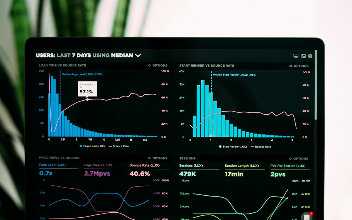
A visitor judges your site in the first few seconds. If the page is slow to load, most users leave without waiting — and that means lost sales. Speed sits at the center of both user experience and Google ranking.
What are Core Web Vitals?
They are the three core metrics Google uses to measure user experience:
- LCP (Largest Contentful Paint): How long the main content takes to appear. Under 2.5 seconds is good.
- INP (Interaction to Next Paint): How fast the site responds to clicks and interactions.
- CLS (Cumulative Layout Shift): Content shifting as the page loads; you want this low.
Why does speed affect conversion?
Every extra second of load time increases the bounce rate. A fast site means more page views, longer visits and higher conversion. Search engines also reward fast sites; in other words, performance is directly tied to SEO.
Practical ways to speed up your site
- Optimize images: Right size, modern format (WebP/AVIF) and lazy loading.
- Reduce unnecessary scripts: Clean up unused plugins and third-party code.
- Use caching and a CDN: Serve content from the point closest to the user.
- Choose modern infrastructure: Server-side rendering and static generation are far faster than heavy setups.
Sometimes the problem is the infrastructure
A setup bloated with plugins over the years may not be saved with cosmetic tweaks. In such cases, moving to a modern architecture is the lasting solution — we covered this in our migration from WordPress to a modern platform article.
How do you measure your speed?
Before you start improving, you need to know where you're starting from. Google's free PageSpeed Insights and Lighthouse tools show your LCP, INP and CLS scores with both lab and real-user (CrUX) data. Measure regularly, not once: check after every release and make sure the scores haven't dropped. You can't improve what you don't measure — that's literally true for performance.
Why does mobile speed matter separately?
Most traffic comes from mobile, and mobile devices usually have slower processors and more variable network conditions. So a site that looks fine on desktop can fail on mobile. Google also bases ranking largely on the mobile version. Serving images sized to the device, reducing unnecessary fonts and avoiding heavy libraries directly lift the mobile score.
At Erofel we treat performance as a default, not a "feature". You can explore our Web Software service or take a look at the web projects we've completed.